Tuesday, September 30, 2008

Statistical Map


www.eia.doe.gov/neic/graphs/maps.htm

A statistical map uses mostly colors and shading in order to portray the statistical breakdown of information it is targeting. The map is usually broken down into separate units with colors that correspond directly to a stat key to indicate what the colors mean. In this statistical map of the United States, average revenue per killowatthour is shown and relates to a key to indicate the differences in each state.
Cartogram

www.poorandstupid.com/2004_11_07_chronArchive.asp

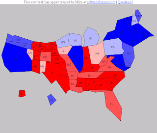
A Cartogram distorts a maps shape and size in order to portray a certain variable or measurement. In this map of the United States the electoral votes are broken down by state. The states with more electoral votes are bigger and the states with less are small. The colors show rather the states are more Republican or Democratic.

Flow Map

mundi.net/maps/maps_014/

A flow map is a map that shows the movement of just about anything. It can be people, goods, disease, communications traffic, and so on. This particuliar map shows the flow of telephone traffic between countries in Europe. The map uses different thickness in the red lines to show how much volume of telephone traffic is traveling between those countires.

Isoline Map of Europe


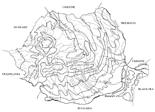
An Isoline map is basically a topographic map that uses mostly contour lines to show things such as amount of rainfall, rock thickness, windspeed, air pressure among other things. This is a map of part of Europe and show the amount of rainfall, how long it lasts, and how intense it is. It would be called a isohyets type of isoline. They are used quite a bit in meteorology.

Monday, September 22, 2008

proportional circle map


A proportional circle map is a map that gives information on different data such as population size or density by using different size circles. This is a map of Europe from 2004 and shows how many Internet users there are in certain areas of Europe. The bigger the circles are the more Internet users there are in that area and the smaller the circle, the less there are in that area.

choropleth map


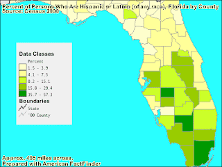
A choropleth map is a thematic map that is shaded to a certain degree of darkness relative to the density of the information that it is trying to present. For example, this map of Florida shows the percent of Hispanics per county. The darkest green is 35.7 to 57.3 percent and correlates to the map as Dade and a few other South Florida Counties. The lightest shade is 1.5 to 3.9 percent and most of the Northern and some central counties are in this range.

Monday, September 15, 2008

Dot Distribution Map

www.mulchblog.com/2008/04/
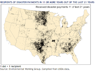
A Dot Distribution Map is really a Thematic Map that uses dots to indicate distribution and the density of population of a particular area off the map. This map shows the recipients of disaster relief payments in 11 or more of the last 21 years. The dark dots represent more payments.

Propaganda Map

fanonite.org/2008/02/11/gaza-wipe-it-off-the-map/

A propaganda map is a map that tries to persuade the people that see it to believe what the map is trying to say. It often has to do with politics, and often during some type of tension or war between different countries. This particular has to do with one of the oldest standing conflicts in human history. Arabs and Jews! The link to the story will give the details, but this is basically a pro-Arab point of view and persuasion.

http://geo.haifa.ac.il/~bargal/book-kkl.htm

Hypsometric map of France

www.maps.com/map.aspx?pid=1316

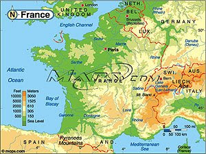
A hyspmetric map is a map that looks to show contours with shading and tinting. This particular map is of France and the green, orange and beige contrasts are the shaded colors used.

Wednesday, September 10, 2008

PLSS Map of Franklin County, Alabama


www.rootsweb.ancestry.com/~alfrankl/landmapfr...

This is a map of Franklin County, Alabama from a website that is used for tracing ancestry and roots. The map itself gives a breakdown of the different townships and Ranges. PLSS, or Public Land Survey Systems are basically a series of separate surveys. They are broken down from medians, townships, sections, and lots. Their purpose is to divide and describe land in the United States.


Cadastral map from 1912

en.wikipedia.org/wiki/Amungula_Parish,_Murray
A Cadastral map is usually the "joining" together of different survey plans by the cartographer. They are used for the administration of land to show ownership of parcels. This particular map is of Bherwerre Parish in St. Vincent in New South Whales. It shows the boundaries of the Parish before 1915 and what portions were transferred to Commonwealth of the Jervis Bay Territory after 1915.

Thematic map Province in Philippines

www.nscb.gov.ph/.../Maps/Poverty.htm

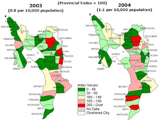
This is a thematic map of the Province of Leyte. It shows the breakdown of crime against property by different shades of colors for the different areas and a corresponding number to match the values. A thematic map is a map that emphasizes an imparticular statistic or geographic element. In contrast to a thematic map, a typical reference map would usually show less specifics of a larger number of different geographic distributions.

Tuesday, September 2, 2008

Topographic Map of Tajikistan

This is a topographic map of the country Tajikistan. A topographic map is a map that shows the relief of elevation and depth. The purpose in contrast to a planimetric map is to show vertical and horizontal features of the terrain on the map. In this map, to the upper right hand corner is a scale to reference just how many meters the elevation is in certain areas of Tajikistan.


http://maps.grida.no/go/graphic/tajikistan_topographic_map


PLANIMETRIC MAP OF THE WORLD

This is a planimetric map of the world as it was 300 million years ago. Planimetric maps are maps that show correct horizontal positions for the features that are represented on the map. The will usually show rivers, lakes, roads, and so on. This map may not be completely accurate because of how old it is, but it does not show any type of indication of depth of sea or land, or height of mountainous regions, as described.

: www.geocraft.com/.../Penn_planimetric_map.html


Mental Map of US


http://geosim.cs.vt.edu/mmap00s.gif

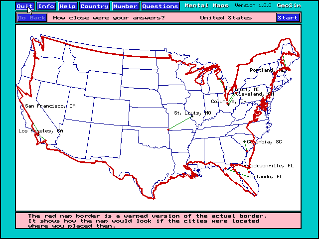
This is a mental map of a students perception of the borders of the United States. Outlined in red is the students mental map positioned over the actual border. It is taken from a mental map program that allows students to test their knowledge of cities, borders, population, and so on.