Sunday, November 30, 2008

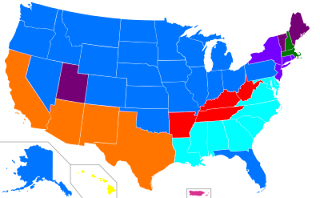
Unstandardized Choropleth Map

en.wikipedia.org/wiki/American_ancestry

An unstandardized map is a choropleth map that gives data that is divided up but not ranked or correlated to any type of statistics, actual numbers, or percentages. This map shows the ancestral descent of most of the people in each state of the United States. Blue is for German, Orange for Mexican, purple for English and so on.


Standardized choropleth map


A Standard Choropleth map shows data aerially with divisions or borders to separate it. It will give the data in some type of unit that is usually averaged out. This map shows the United States population in 1999.

Univiariate Choropleth Map

www.cdc.gov/pcd/issues/2007/oct/07_0091.htm

A Univariate map is one that only shows one set of data. This map shows the location of counties in which poverty rates are at least two standard deviations lower than the national mean and comes from a national census website.

Bivariate choropleth maps

www.geocities.com/stevejford/new_page_2.htm

A bivariate choropleth map displays 2 variables on a single map by combining two different sets of graphic symbols or numbers. The above image shows land use, life expectancy, and GNP per capita in Africa in 1989.

Unclassed Choropleth Map


An unclassed choropleth map does not classify the data, but simply show as many different colors as there is areal units. This map shows different economic breakdowns of the regions such as economy, education, population, and so on.

Thursday, November 27, 2008

Classed choropleth maps


www.ilstu.edu/~jrcarter/Geo204/Choro/

A classed choropleth map is an aerial map that breaks that colors on the map into a specific and small number, usually four, that give a data range for that area corresponding to the quantity of data in the color key. The map above shows the amount of males to females in the United States from the Census statistics in 2000.

range graded proportional circle map

http://www.d.umn.edu/geog/cartfolder/HTML%20Pages/Map-Types.htm

A range graded proportional circle map is a map that uses circles to show data that are divided into groups with the idea to make the size of the circle to correlate directly to the quantity for that data given in the symbol key. The above map shows population in Europe.

Tuesday, November 25, 2008

Continuously variable proportional circle map

www.lib.utexas.edu/.../west_germany_ind_1972.jpg

A continuously variable proportional circle map is a map that uses circles to show variables in the sizes of the data given. This particular map shows major industries in West Germany by using the different size Circe's.

Monday, November 24, 2008

DOQQ map


A DOQQ is a digitized image of an aerial photograph corrected for displacements caused by camera angle and relief with a purpose of creating true geographic proportions. DOQQ is abbreviated for Digital Orthophoto Quarter Quadrangle. The above image is from a Pennsylvania spatial data website.

DEM map

www.humboldt.edu/.../350_maps_airphotos.html

A dem is a digital elevation model, and is a digital representation of ground surface topography or terrain using raster grid or triangle irregular network. This image is from a Geomorphology website and is over Chittenden, California.

Monday, November 17, 2008

DLG map


DLG stands for Digital Line Graph and are digital vector representations of cartographic information. In other words, a geological survey map used to show themes like roads, rivers, railroads, etc. The above map is a DLG map that shows hiking trails, camping sites, and other information from the Tosohatchee wildlife management area.

DRG map

www.tccycling.com/reports/tahoe/stanford-paig...

DRG is short for Digital Raster Graphic. A DRG is a digital representation of a hard copy USGS Standard Series Topo map. DRG's are sometimes created by scanning the original hard copy map and then georeferencing the image so that it has positional coordinates and can be used in mapping applications. They are also refreshed on an annual basis. The above map is of Auburn state recreation area and is a DRG map.

Wednesday, November 12, 2008

Isopleth Map

www.weathernotebook.org/features/winters.html

An Isopleth map is a map that uses lines or colors to represent similar regional aspects, or areas with equal value of a certain dimension. Those dimensions may include temperature, elevation, rainfall, and so on. This map is of the United States and Canada and shows mean annual snowfall.

Tuesday, November 11, 2008

Isopach Map

pubs.usgs.gov/.../USGS_3D/ssx_txt/petrol.htm

An isopach is a line on a map drawn through points of equal thickness of a certain unit of area. The above map is from a oil field in Powder River Basin, in Wyoming and Montana. The map shows the amounts of a certain type of Sandstone called Sussex "B".

Isohyet Map


www.irrigation.gov.mm/water/climateandrainfal...

An Isohyet is a line drawn on a map in order to connect points that have equal amounts of rainfall. The maps above show the precipitation of Myanmar in millimeters. The map comes from an irrigation website with conversation about agriculture and cropping in relation to rainfall.

Monday, November 10, 2008

Isotachs


Isotachs are lines on a map connecting points of equal wind speed. The map above shows the Midwestern to western United States and Southwest Canada with some isotachs and wind speeds written with the isotachs.

Isobar lines


Isobars represent lines of constant pressure and on surface maps they can represent stational pressure readings reduced to sea level in order to eliminate the effects of the different heights of reporting stations. This surface map shows isobars as well as highs, lows, trough's, and ridge's.

Tuesday, November 4, 2008

Lidar mapping


coralreefs.wr.usgs.gov/mapping_lidar.html

Lidar mapping is commonly used for acquiring high resolution topographic data that uses airborne laser ranging with light detection. This image is of South Moloka's reef tract which is a reef in the pacific.